Transports of Delight
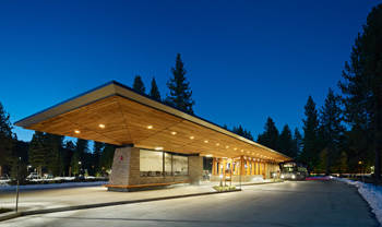
It probably wouldn’t make Edward de Bono’s Top 10 Lateral Thoughts list, but the recently opened intermodal transit centre at Lake Tahoe in the US is an object lesson beyond its obvious architectural beauty.
City planners around the globe are traumatised daily by the prospect of yet another city in gridlock. They know public transport is a major part of the answer, but how to get more citizens to ‘climb on board’?
Addressing the latter question was a major reason why the designers of the Tahoe City Transit Centre chose timber as the primary architectural feature.
Lake Tahoe, bordering California and Nevada, has become a year-round residential community and popular recreational retreat for the 11.5 million people living within a four-hour driving distance.
Inevitably, traffic congestion, inadequate parking and pollution have begun to threaten Tahoe’s natural resources. To encourage greater reliance on public transportation, the county asked WRNS Studio to design an intermodal transit centre.
WRNS architect Wright Sherman told us a key sustainability goal was to impart a sense of pride to public transit users with architecture expressive of its resource-conservation ethic – ergo, timber and stone.
This story got us wondering why there aren’t more timber-based public amenity structures serving public transport in Australia – and we will be blogging about that quite soon. Meantime, we invite you to check out the full Tahoe Transit Centre story on our website.

Tahoe City Transit Centre – an object lesson for planners.
Photo: ©Bruce Damonte
timber+DESIGN is Back on the Web
We like to call it ‘flying outside the egg’* – taking positive action to improve your chances of survival before it is too late.
When we launched the tablet edition of timber+DESIGN about a year ago, we really did think we were about to fly! We were captivated by the power of the app as a conduit to millions of readers and maybe hundreds of advertisers. But it doesn’t work like that.
In our experience, Apple and Adobe provide inadequate (and unaffordable) support for print apps like timber+DESIGN, and online publishers and their advertisers are increasingly dissatisfied.
We’ve turned our back on the tablet and recently launched our new web-mag format, with powerful images, easy-to-read and printer-friendly text functions, and greater scope to tell timber design stories – more frequently.
Whether you are a tablet user, at your desktop or laptop, or want to check us out on your smartphone, the timber+DESIGN web-mag is now just a click away.
*From an original quote by C.S. Lewis.
