Overview
As San Francisco-based multinational tech companies like Yelp Inc. move to urban locations where space is limited, the collegial spirit of Silicon Valley survives through new modes of expression in high-rise buildings and converted industrial facilities.
Yelp was drawn to the historic charm of the former Pacific Bell Telephone Company headquarters – designed by James Rupert Miller and Timothy Pflueger in a neo-gothic come art deco style. Opened in 1925, it was the city’s first modern skyscraper – intended as a monument to Western progress, and the telephone in particular.
For the new occupier, architect/designer Studio O+A developed the concept of a ‘vertical campus’– an all-encompassing, self-contained community stacked on multiple floors. “As with most multi-story occupancies, the design challenge was to facilitate group dynamics so people interact with each other, even though they work on different floors. In other words – how do you create a neighbourhood in a tower?”
Structure
The 140 New Montgomery, San Francisco address of business information company Yelp is the former iconic headquarters of the Pacific Bell Telephone Company (aka AT&T).
“The entirely redesigned interior of the building is now exposing young people to an idea of beauty in their lives that a lot of them don't know," says one of the architects involved. "The building subliminally has a great message that is very nuanced. It's an old building that's repurposed with intelligence."
Yelp occupies nine floors of what once was the city’s tallest building, its neo-gothic/art deco stone and plaster facade apparently inspired by the landscapes of Yosemite and the Sierras.
Studio O+A answered the challenge of facilitating group dynamics across multiple levels by giving each floor a ‘destination’ with appeal to all the floors.
“For instance, we placed a fully-equipped coffee shop on the 8th floor, a break room with window seating on the 5th, and semi-private pods for chess or chatting on the 11th. Each floor’s common areas thus become common to the company at large and not just to those whose workstations occupy that level.”
Exterior
The 26-floor building now housing Yelp and numerous other high-achieving companies opened in 1925 as the first significant skyscraper in San Francisco. It is 133 m high and clad in nine different shades of grey granite-like terracotta. Its original construction cost US$4.55 million.
Architects Miller and Pflueger were heavily influenced by Eliel Saarinen’s second prize-winning design for the Chicago Tribune tower in 1922 – a concept that was never executed. Saarinen used vertical elements and gradual setbacks in his design, which are characteristics of the Bell Telephone building.
Bought in 2007 by developers Wilson Meany, the building has undergone a US$50 million-plus renovation. The new owners worked closely with numerous preservation boards and organisations responsible for historic building oversight to keep as much of the original building as possible.
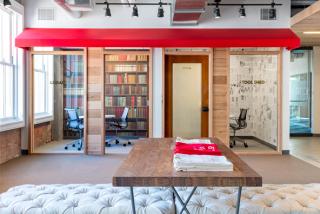
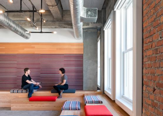
Wood has played a major role in ‘warming’ all nine refurbished floors now occupied by Yelp. “The existing space was so cold and wood warmed it up,” say designers Studio O+A. “But the timber decision was not straightforward – cost is always a challenge when specifying wood.”
Interior
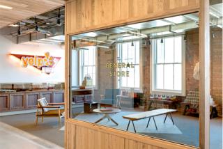
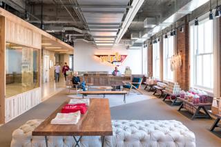
Yelp’s reception area is on the 9th floor, and to make it worthy of a trip up or down in the elevator, the designers created a ‘general store’ – a modern pop-up improvisation on the company’s perceived place in the new world of commercial entrepreneurship.
“Taking our cues from an era of commerce when candy was sold in jars and signage was gold-leaf painted on a window, we created a lobby with the layout of a retail operation,” say O+A.
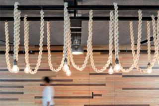
Brick walls and its naturally lit seating area give the coffee bar space a SOMA cafe texture. Access to the bar storage and service areas is through a blind door that appears to be a smooth wooden wall. Custom lighting in this area is suspended from individually hand-woven rope fixtures.
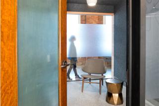
Reclaimed doors with frosted glass panels recall fine craftsmanship of the past.
Within the constraints of a tight budget the carefully planked coffee bar wall is a standout. The designers used a template to get the right mix of Douglas fir, walnut and red oak.
O+A sees timber as providing visual unification across all nine floor of Yelp’s ‘vertical campus’.
