18 Hunter Street
Hobart TAS 7000
Australia






Overview
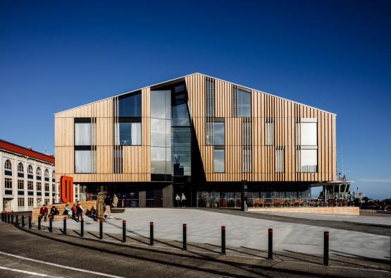
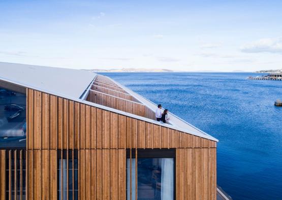
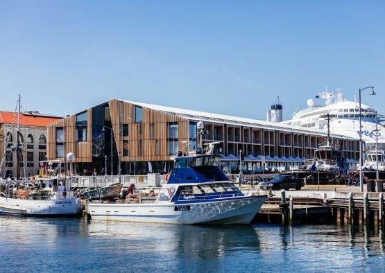
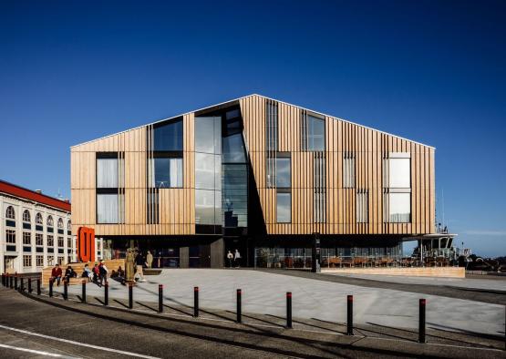
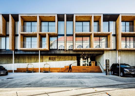
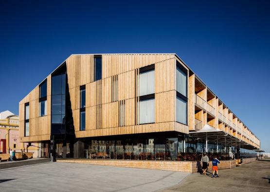
The design concept of Mac 01, by Circa Morris Nunn, was to create a ‘re-purposed warehouse’ to reflect the historic location and vernacular of the wharf area it’s situated in. The gently pitched timber structure perches out over the wharf, standing proud as a modern, innovative form, but presenting as a product of the wharf's nautical history. Sizeable cutout sections have been made in the roof to create outdoor balconies for the rooms, maximising views and outdoor space.
-42.8822128, 147.3364267
Structure
Timber played a big part in the structural composition of Mac 01. An engineered timber system of LVL joists and beams provides the foundations. Pine and lightweight steel form the framing, with particle board and plywood providing floor covering and lateral support. Using a combination of timber and steel was an essential part of the structural process that was defined by the foundations. The hotel sits on concrete piles under the wharf apron. Each concrete pile takes a live load of up to 70 tonnes, which is perfectly adequate for a single story shed, but testing with a 4 storey hotel. The lightweight steel frame ensured the weight requirements were met, while timber cladding was the obvious lightweight choice for exteriors and interiors.
Exterior
The exterior facades and decking of Mac 01 were clad in white cypress timber. The timber was chosen for its robust weather resistance, it was left untreated, and will naturally grey off in the marine environment. The building is Hobart’s first modern, public piece of architecture to utilise timber as the main exterior cladding. The shiplap cladding style references the nautical environment. The timeless quality of the timber has been very well received by the public. Flat boards form the basis of the cladding system, while perpendicular vertical boards create texture and privacy screens for the windows. The east and western facades address two adjoining forecourts, with each suite providing a pattern to the monolithic form. The north and south facades feature a central, faceted recess that creates a defined entrance space, while breaking up the form.
Sustainability was not only interpreted in the form of materials by Circa Morris Nunn, but in the form of cultural sustainability; a building must withstand the test of time in it’s context to be truly sustainable. The decision to take a backwards-looking approach to the design was to ensure that Mac 01 fits snugly into the historic context, and capture the spirit of the location, but with updated materials, fittings and fixtures. Timber is a contentious issue in Tasmania, with sustainable sourcing at the forefront of the public consciousness. Circa Morris Nunn sourced all timber through companies that offer assurance of step by step sustainable farming practices.
Interior
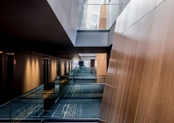
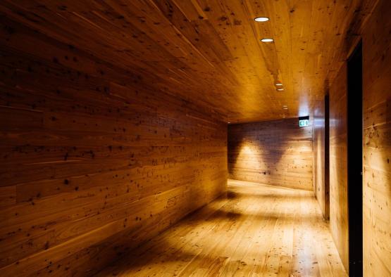
Internally, timber cladding was chosen to give ‘life’ and a natural aesthetic to building. Plywood is a major feature, along with Tasmanian oak flooring and black tiling. A large central atrium towers up the middle of the structure, allowing light to overflow through the expanse and open up the space with high volumes. A large raking duct cover offers drama and scale to the public corridor. Tasmanian oak veneer ply forms the cladding for the void.

