Overview
Overlooking breathtaking fjords and a stretch of Norway's west coast archipelago, Villa Storingavika is a robust yet refined vessel from which to appreciate the delicate coastline and sometimes rugged climate. It is a pale timber volume enrobed in a crisp, 'pleated' dark timber exterior.
When the owners first approached architect Todd Saunders, they had a clear idea about what they wanted. Their brief called for an upper level with generous open-plan living rooms and a master suite, while a lower level that would be used by their children was to include a small self-contained apartment. They were also specific about details, asking for no trim or architraves around doors and windows and no baseboards or skirting where floor meets walls.
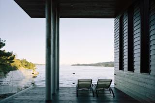
The main part of the house is laid out over two floors, with the main entrance leading directly into the upper floor from the rear. The house itself forms a long thin structure with a cantilevered balcony at one side, extending 6 m and resting on 3 steel poles. The main façade of the house faces south to the ocean while the balcony offers stunning views to the south and west. The balcony is covered to provide protection from the worst of the Bergen weather, while a band, extruding 60 cm, runs along the main part of the house to give protection from the sun. This feature, running in a continuous line, also lends a stylish graphic to the house. The upper floor is to be used by the parents and the lower floor by their two children when home from university. The lower floor also contains a small (35 m2) guest studio.
Structure
This house is well-grounded in the terrain. On both storeys, the utility and service rooms are located along the northern side of the house, while the living areas open out to the south and the view to the sea. As a consequence, there are very few punctures on the northern side, and large floor-to-ceiling windows face the south. Emerging from the landscape-bound volume of the house is a lightweight wing of space; a six metre long cantilevered balcony. "We were experimenting with different room heights" says Saunders. "They vary from the lofty balcony ceiling to a level just above a low six metre long window where the space is most compressed." The height of the outdoor room, the tallest section of the house, signifies its importance in the scheme. Notably, the exterior ceiling timber continues into the house in the lounge room where the ceiling height is as tall as the balcony. The balcony is pierced by three circular steel columns that are 'threaded' from the ground to the roof.
As a work of architecture, Villa Storingavika is a textbook example of a regional modernism, combining the modern gesture of wide spanning platforms of space with the traditional forms and materials of Bergen's light-framed timber houses. The building's proportions are also akin to Bergen's maritime architecture and its long history of two-storey timber buildings. Translating this established building approach to a restrained, contemporary volume links the house to its context, and ties it indelibly to the site.
Exterior
The site of Villa Storingavika comprises a rocky outcrop and garden but is essentially a rather compact area. "My primary aim," Saunders recalls, "was to create more open space than the site first offered by reclaiming as much outdoor space as possible". The house is oriented along the contours of the site and concrete stairs link an upper outdoor terrace with a lower lawn, utilising all of the natural terrain. This also minimises the impact of the house on the topography. Built-in outdoor furniture is also integrated into the site, increasing the use of the lower terrace as an extension of the interior space.
A deep 60cm folding edge separates the house from the outside space, and as it snakes up and around the façade creates a deep shadow that defines the strong graphical composition. This volumetric depth also creates a zone that interlocks internal and external space. As Eli notes, the outward extension created by the folding edge and the outdoor balcony rooms "makes the house look bigger than it actually is."
In its composition, the building relates to the outcrops of coastline that it frames. Metaphorically, the house could be compared to the eroded outcrops of rocks it overlooks, with its cantilevered ledges and deep reveals and apertures. It has a sense of permanence that grounds it to the landscape.
Interior
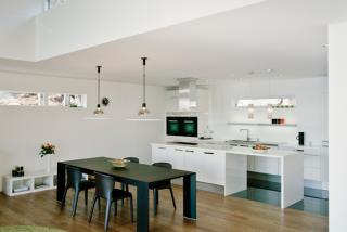
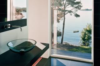
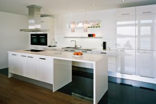
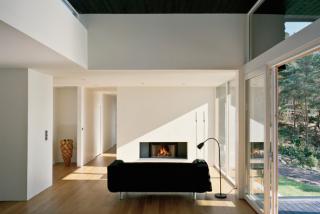
Interaction with the view and a poetic transition from inside to outside lends richness to the stark interior. The rough-sawn weatherboards catch jagged shadows with their tapered profile. Moving inwards, this inky timber layer is then seemingly 'peeled back' to reveal the smoother Canadian cedar that is ship-lapped in a shallower profile. This middle layer is the transition to the pearly white interior with its smooth and uninterrupted surfaces that are free of cornices and superfluous trims. It's an interlocking of volumes in a simple but exciting spatial experience. Stark yet harmonious contrasts in texture and tone of materials give clarity to the architectural ideas.
Three main materials are used in the project: glass, black-stained fir and oiled Canadian cedar. All of the decorative and aesthetic qualities of the building come from the materials themselves and the dimensions of those materials. It is a very elemental, minimal response to the place, and continues through to the simple, robust and utilitarian details. Even the heating of the house arises out of the conditions of the place. A 200m long pipe extracts the constant heat of the ocean water, then recycles this heat back into the house to heat the floors. The system uses a fraction of the electrical energy that would otherwise be required for heating.
