Overview
This competition winning design for a 3,500m2 extension to the existing Gösta Serlachius Contemporary Art Museum in Mänttä, Finland utilises wood throughout the entire design. Despite Finnish architecture's affinity for wooden design, this contemporary project signifies one of the first examples of large public buildings to feature a wooden structure alongside external wooden cladding and interior wooden finishes.
Designed by competition winners MX_SI, from Spain, the project was developed in co-operation with local Finnish architects Huttunen-Lipasti-Pakkanen.
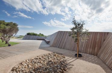
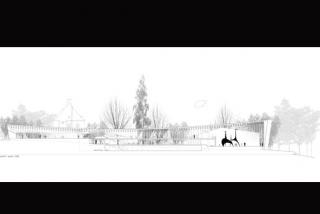
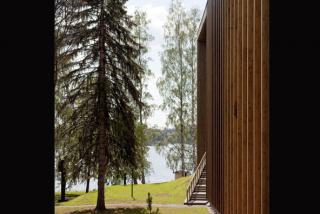
Featuring a very typical Finnish setting amongst numerous birch and spruce trees, and along a lakefront setting, the building sits elegantly thanks not only to the relentless use of wood but its subtle curved overall forms and delicate cladding details. Allowing the surrounding forest to penetrate the bounds of the building through these subtle gestures – in conjunction with more rigid formal cuts decorated in highly reflective glass surfaces – the visual impact of the building on its historical context has been greatly limited.
This wooden box pronounces itself quietly yet elegantly thanks to the varying methods of wooden design employed throughout the project.
Structure
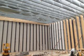
The structure dominates the visual identity of the whole building. Approximately 250mm wide and 1000mm deep, the locally sourced spruce Glulam rises from its foundations in conjunction with the exterior vertical mullions which spread across the entire building.
The choice to use local materials was made through considerations of convenience as well as those of local history; the traditional Mänttä industry has focused on wood processing and the museum's primary patron owned one of Finland’s largest paper mills.
The spruce laminated structure spans the entire width of the museum, freeing internal space and allowing flexible future development. Additionally, the approx. 1000mm thick beams have been over-engineered to be able to support pieces of large scale art if needed.
The primary structural frames, a basic post-and-beam like configuration, varies slightly with each progression across the structural grid. To follow the subtle curves of the building's footprint, the sudden cuts into its form and its concave roof, each frame is unique to its neighbour.
In addition to being a dominating feature of the exterior, the exposed Glulam structure is unobscured internally too.

Exterior
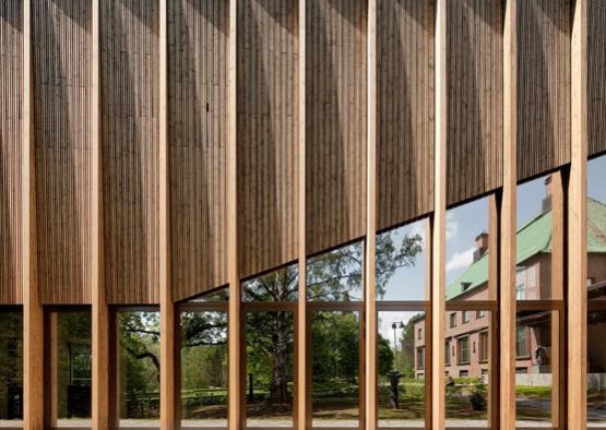
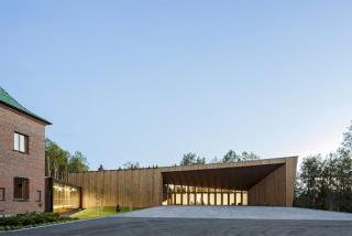
Externally, the structure is highlighted through vertical mullions that were intended to resemble a ‘densified abstract forest’. This is successfully achieved through the committed repetition of the vertical members amongst the actual forest copse in front of the building.
Additionally the entire building façade is given life through a unique and clever system of twisting strips of spruce between the exterior mullions. The spruce used has been tensioned to its maximum potential to create surfaces which sit between the strong vertical members. Beginning parallel with the structural line - either at the top or bottom of the façade – the panels subtly twist as the surface rises or falls. This twisting gives the entire façade a three-dimensionality, rhythmically breaking up the exterior surface and casts unusual shadows between the exterior vertical mullions. Consisting of 30 strips of thin 5m long spruce wood, the twisted panels assist in the representation of the abstract forest.
A golden hue has been added to all the building's wooden components. Intended to act like the living material of which it is composed, the building will show the changing effects of time on the wood. As it ages, this golden tint will fade and give the building an overall aged spruce grey colour.
Interior
This building, once again, demonstrates that issues with wood and fire can be overcome (and also that most of these issues are simply common misconceptions) while also showing that elegant wooden design can still exist when abiding to fire safety laws.
Despite obviously strict fire regulations, the structural wooden frames have been left visible inside the entire building. This allows visitors to experience an emphasis on the curved roof through the progression of each exposed and sharp, rigid timber frame.
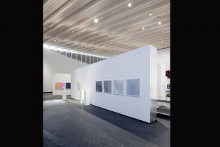
Additionally, the natural tone of the interior structural members and ceiling treatment warms the internal space, highlights the use of wood throughout the building and focuses the attention of visitors towards the artworks and other contents of the building which are set against their blank ‘canvas’ white walls.
The pale structure again contrasts to the buildings internal floors, plunging sharply into dark timber floor and stone tiles.
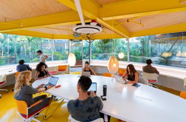
Oddly enough, the most interesting moments of the museums interior is through its interruption. The pale spruce laminates of the interior give way for darker external components and glass surfaces, which penetrate the interior spaces allowing greenery and sunlight into the building and partial views out across the recesses.
