

Overview
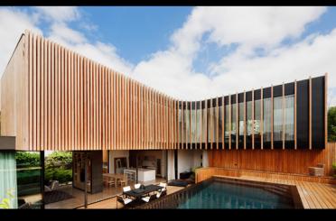
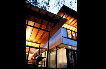
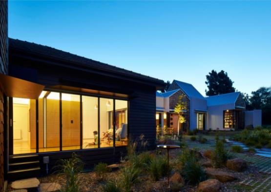
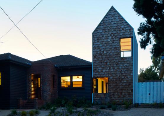
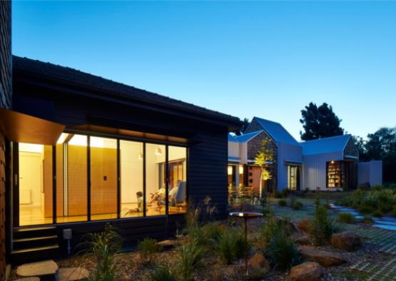
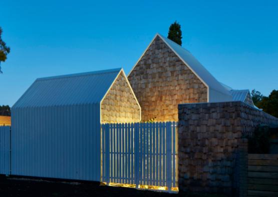
Tower House is a renovation and extension to a weatherboard home in Alphington, Victoria by Austin Maynard Architects. The original house, in which there are now two kids’ rooms, a bathroom and living spaces,was restored. A studio, bedroom, bathroom, kitchen and dining occupy the new part of the house. Tower House is the result of endless conversations with a trusting, enthusiastic, patient and encouraging client.
Tower House is near parkland and the Yarra River, with views to the Amcor chimney stacks. Tower House is bound by two roads; one a leafy post-war suburban street, the other, which faces onto backyards, feels like a rural country road. With the exception of a few new homes the context is small, humble weatherboard and brick abodes, meaning that a chunk of large contemporary architecture would be an imposition in this context.
Tower House is a long-term family home and the boys will be adults when (if!) they leave. The house can easily adapt from being a shared family home to being two separate zones with distinct entries. Within the original house there are hidden sliding panels which allow the large shared rooms to be divided into smaller spaces. A variety of different activities can take place, whether shared or private; the best of both worlds.
Structure
Like all the buildings of Austin Maynard Architects, sustainability is at the core of Tower House. Rather than simply extruding the extension from the existing structure, the new form has been run along the southern boundary so that it is soaked with sunlight. Many different features have been included to maximise the energy efficiency of the house, including:
- the openings and windows have been designed to optimise passive solar gain, thereby drastically reducing demands on mechanical heating and cooling.
- all windows are double glazed
- white roofs drastically reduce urban heat sink and heat transfer internally
- need for air-conditioning is eliminated through active management of shade, and flow through ventilation
- water tanks have their place, as they do in most of the buildings from Austin Maynard Architects
- high performance insulation is everywhere, even in the walls of the original house
Exterior
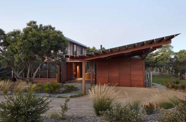
When designing the Sydney Opera House Utzon spoke of the fifth façade, knowing that the roof will be the part of the building that dominates the view from the Harbour Bridge and the tall buildings nearby. In a similar fashion, the ubiquity of Google Earth opens up the view of the roof to anyone at any time. It is now possible to easily see all of the mess that has been hidden on the rooftop, but by the same token what was once hidden can now be put on display. With this in mind, Tower House was deliberately designed so that it looked beautiful from the sky and from Google Earth.
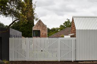
Increasingly our houses are overly concerned with privacy. Fences are getting higher, we are turning our backs to our neighbours and our houses are starting to look less like homes and gardens and more like compounds. Tower House tries to merge a secure home with a communal village. The front yard is now a communal vegetable patch, with the neighbours invited to help themselves and, if they wish, do a little gardening from time to time. The rest of the garden has a high fence around it; however it is possible to see through the fence and, importantly, the gates can be left open wide. With streets on both sides of Tower House, neighbours can use the garden as a short cut and grab a few veggies on the way through. With the gates wide open the line between public and private starts to get blurred.
Interior
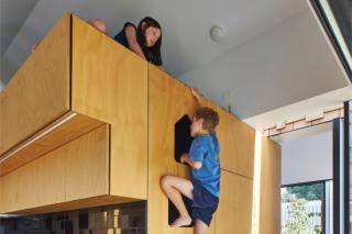
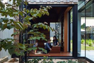
Australia is wide and flat. As a result our homes are wide and flat. Multiple projects from Austin Maynard Architects have explored the idea of creating a vertical home, in contrast to the typical Australian design, and the boy’s studio in Tower House pushes this idea further. It is a wholly vertical space with a bookshelf running from floor to ceiling. The boys desks are at the base of the studio, where they can studiously work. Hanging within this tall space is a net where the boys can read and contemplate with a view to the street and the backyard. The boys study is designed to inspire the boys as they grow and learn.
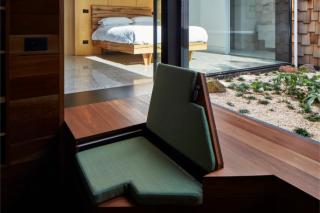
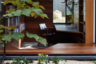
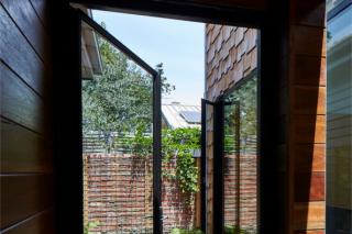
The house's library is a place of thought and contemplation. Slightly submerged, the desk is almost buried in the garden. Lined with dark spotted gum the library has an age and a wisdom that is in contrast to the playful contemplation of the boys study.
Hidden above the central console in the kitchen is a sneaky spot overlooking the dining and living areas. Lined in synthetic grass, it is a hideaway within the centre of the house.
