Overview
The NZI Centre’s core building concept was inspired by the socially sustainable and environmentally conscious values of the building occupant.
The responsive forms that wrap and enclose act as an exo-skeleton, complimenting the fit-out philosophy of an ‘organisation as living entity’ with the major interior elements becoming delicate and considered insertions sitting within, resting above and softly reaching for the building fabric and framework, creating a sense of balance and harmony.
Timber is used to highlight important insertions within the architecture. It is used to add warmth to the white base building exoskeleton. As the base building is raw and quite cold, it was important that the insertions had a tactility that lent the warmth to the space. The timber is located in places that are able to be touched by the occupier appealing to the haptic as well as the visual senses.
Tasmanian Oak was chosen because of the natural texture of the colour tones. It is made up of the three species (Eucalyptus delegatensis, E. obliqua & E. regnans) which gives the timber a diversity which adds to the variation and richness. It was felt the combination of these colours resembled (despite its origin) a very “New Zealand” aesthetic, the pink and warm brown resembling some New Zealand native timbers and the silvery/grey the weathered timbers of baches. This helping to reinforce NZI as one of the oldest brands in New Zealand.
With over 700 occupants, timber has been used to assert the spaces that are for everyone. It warmly invites everyone in the company to use the stairs, the atrium meeting rooms, the heritage space, and the Lilli-pad breakout spaces. Tactility is reinforced with the oversized Tasmanian Oak handrail to the atrium balustrade as well as the stair guide.
Structure
Meeting Rooms
Timber Cladding – Tasmainian Oak veneer was used on Medium Density Fibreboard with low fuming formaldehyde emissions to meeting rooms around the atrium edge. The panels are embellished with a custom graduated perforation to achieve the strict acoustic needs of the atrium.
Stairs
The stairs are wrapped in Tasmanian oak, with their different colour tones adding texture ensuring a natural non-homogenous aesthetic. The timber battens were cut into parallelograms to fit with the slope of the stair and meet the battens on the landings seamlessly. The ends of the parrallelagrams are seen through the glass balustrades that line the inside of the stairs allowing the user to get a glimpse of the construction of the stair lining. There are 1,412 separate timber battens used on the underside of the stair – all hand pinned into the correct location.
Heritage Wall
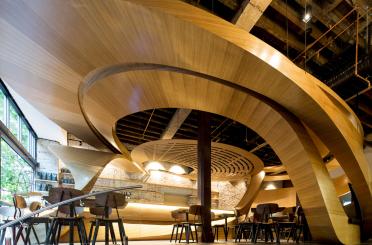
Undulating battens float off the floor and add another layer of texture to the atrium. This was conceived as a flowing timber curtain what wraps the face of the atrium edge. Glass faced boxes with hidden locking are inserted into the wall to house IAG’s heritage items. The heritage wall and the timber batten wall behind the public café enclose the activities behind without giving an overly solid block to the public. These also add to the acoustic performance needed around the atrium perimeter.
Entry cube
In contrast to 14 tons of 20mm thick mild steel exterior of the entry, the inside is lined with warm and inviting timber battens. This juxtapositions was important to provide clues to the sustainable and human nature of the environment within, giving an introduction to the softening nature of the timber within.
Exterior
The NZI Centre was an extremely challenging project that involved working closely and co-ordinating with the main contractors for the base build, Scarbro Construction. Hawkins Interiors delivered a programme of works specifically tailored to suit that of the base build, in particular where scaffolding and access to floors were critical factors in planning.
This was a significant project for Hawkins Interiors as the fit-out was the first commercial building in New Zealand to receive a 5 Green Star rating using the NZ Green Building Council Office Interiors rating tool (one of two pilot projects in 2009), which represents ‘NZ Excellence'.
The fit-out covered 8,000m2 of space, which comprised several distinct elements: level one including the atrium, staff café area, training rooms, and Wildfire kitchen; level two to five’s office spaces including the lily pads, atrium edge meeting rooms, and tea stations; the internal stair; the comms rooms on levels one and four; and the green roof.
Level one was the most demanding of the floors, not only because it is the largest, but because it serves a wide variety of different functions and houses some extremely detailed design features. Looking up from the atrium, the meeting rooms are cantilevered off the edges of the floors. Building and cladding these pod rooms in decortech and veneer required a high level of precision. Accessibility was also a major hurdle to these areas that we had to overcome. Once the marble was laid in the atrium (and there is a lot of marble) Hawkins Interiors could not scaffold or use EWPs.
Major construction of the heritage feature wall at the southern end of the atrium proved challenging. Over 15m in length and over 4m in height, this Tasmanian oak battened wall is a beacon for the building. It houses some of Auckland Museum's finest pieces of art in purpose-built cabinets that are a part of the wall.
The Wildfire Kitchen sits at the northern end of the atrium. From this full commercial catering kitchen, NZI has the capacity to not only host the café patrons but whatever function they desire without having to outsource. It also hosts the NZI staff in a wonderful staff café area at the rear of level one. The final element of level one is the training space that contains some complicated two-layer decortech and suspended tile feature ceilings.
Interior
Social and environmental sustainability were the focus for the new NZI Centre in Auckland designed by Jasmax. Andrea Stevens discovers a sophisticated office building stitched into the fabric of the city.
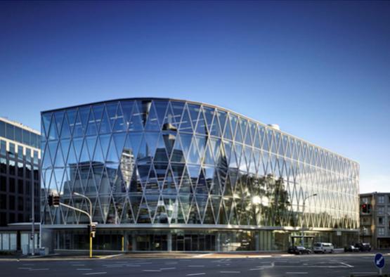
With many New Zealand organisations in the throes of redefining themselves, our built environment is being subtly steered by a different set of influences. Environmental and social sustainability are becoming essential ingredients in many briefs, and designers are increasingly challenged to meet local cultural and climatic conditions. The highly engineered NZI Centre is one of Auckland’s newest 5 Green Star buildings. ts elegant structural and mechanical solutions are visible throughout, supporting its aesthetic richness.
The site is located in the Viaduct Harbour precinct, bordering the CBD. Once an industrial area with timber yards, food markets and fishing boats, the 2000 America’s Cup saw its conversion to an upmarket, mixed-use neighbourhood. It is a prime location, being only a few blocks from the ferry, bus and rail terminals, and with exceptional public visibility.
The triangular site is set on a busy intersection, and over-looks a small plaza and the city centre. This long eastern elevation offered an incredible opportunity to relate the building to its urban context. The architects designed a large atrium adjacent the plaza, and set the working floors along the western boundary. The atrium subtly filters the city yet offers an expansive view back to it.
“It was about having a focus that allowed staff to look into the atrium and then onto the city. And certainly the city looking back down on this active atria, where the life of the building revolves,” describes Design Director Nick Moyes.
Entry into the building is via a white steel pavilion offset to the street, drawing staff and visitors into the centre of the atrium. On the day I visited a Christmas choir were performing. The atrium acted as a concert chamber with people populating balconies, stairways and bridges to view the performance.
Bridges link to ‘islands’ at each level, which contain meeting rooms and coffee bars, providing more neutral spaces to retreat to. Cleverly stacked and twisted 90 degrees, they create double height spaces within the larger atrium. Floor edges and meeting rooms literally hover - cantilevered or supported on slender piloti.
The lace-like delicacy of the triangulated glass façade creates facetted reflections and shadows, stitching itself into the fabric of the city. Reflections are continued inside, in the polished marble floor and glass-backed lift tower, further dematerialising structure and enclosure. The architects have achieved fineness in scale by separating the elements and painting the structure white.


